
Converting Mobile VoIP Users
Exploring ways to convert free trial users to customers.

Summary
A telecommunications startup with a native mobile Voice Over IP (VoIP) app was experiencing low conversion rates of free users to paying customers. Our goal was to explore ways to increase user engagement and convert more free users to paying customers.
My approach involved reviewing and analyzing available user data, reviewing user behavior analytics, wireframing, hi-fi UI design, and facilitating a strategic UX workshop. The result included designs for new features to educate and improve conversion rates of prospective customers, and a strategic outline for answering outstanding research questions.
Context
The Problem
Flyp is a telecommunications start-up that offers a native mobile VoIP app that supports multiple phone numbers on a single device and offers an alternative to costly long-distance calling. Users were confused about the technology and few were converting to paying customers.
This was a problem for the business because the company’s business value was driven by paying subscribers to 2 or more lines. This was a problem for users because they would miss out on the full value of the solution.
Target Audience
The product’s broad application solicited various users. In the U.S., the target audience was real-estate agents, who valued the ability to use multiple phone numbers with area codes specific to their listings. For Latin American users, the target was anyone needing an affordable solution for international calling to/from the US.
Our Team
Our team consisted of UX designers, iOS and Android developers, and internal stakeholders. I was a UX intern on the UX team of 3.
Vision
Our vision was a new app feature to educate free users about Flyp, increase free user engagement, and drive higher conversion rates of free users to paying customers the U.S. We also sought to deliver an experience to nudge prospective Latin American customers to purchase their first line.
Process
Discovery
First, I reviewed the application, starting from download to calling and texting with my first (free) phone number. Then, I reviewed existing user and marketing data, including research-backed personas, survey results, and user testing data from UserTesting.com.
While reviewing user testing data collected from a study conducted before I joined the team, I captured key clips and quotes from sessions. I compiled, analyzed, and shared my takeaways in a rainbow spreadsheet.
Takeaways from all data sources were compiled into a learning plan to document what we know. A key takeaway was that after downloading the app, new users were confused about how it worked and were skeptical about using it, with some citing fear of being overcharged by their service provider.
Design
Help Content
I took lead on designing a new help content to explain how Flyp works. Early low-fi wireframe iterations used copy focusing on the technology. After team and stakeholder feedback, later iterations focused on value propositions and intended outcomes for customers. Over time, I increased design fidelity to Axure prototypes for Android and iOS.
Free Trial
In parallel with designing help content, I explored ideas for a new free trial experience.
With the company’s sights on the Latin American market, we assumed ‘the first number is free’ model would not translate well in terms of business value because customers would value the first number with a U.S. area code as much, if not more, than multiple numbers.
I proposed a more engaging, time-constrained free trial that nudges users to invest time with the app, use it, and learn about it in the process. Whiteboard sketches of the trial flow led to a series of Balsamiq wireframes of the UI that were then presented to the team for feedback.
Research Strategy Workshop
The team had many open questions about users, especially Latin American users. While working on designs, I passively gathered questions from the team and stakeholders by writing a prompt on a whiteboard wall and leaving sticky notes on an adjacent table. I emailed the company to solicit participation and provide guidance for the exercise.
Next, I planned and conducted a workshop during which participants were asked to fill out a matrix with gathered questions and any new ones. We identified themes through affinity diagramming and voted on theme priorities before debriefing.
I concluded the workshop by sharing its results with participants and communicating the top 3 research theme priorities: payments and trust, trial (time and conversion), and product benefits and challenges. All research questions organized by themes, types of research (e.g., discovery vs. validation), and priority were shared in a spreadsheet.
Result
The effort concluded with a hi-fi help content prototype and low-fi free trial designs for testing, and a set of user research and testing priorities with accompanying goals and questions to initiate planning studies.
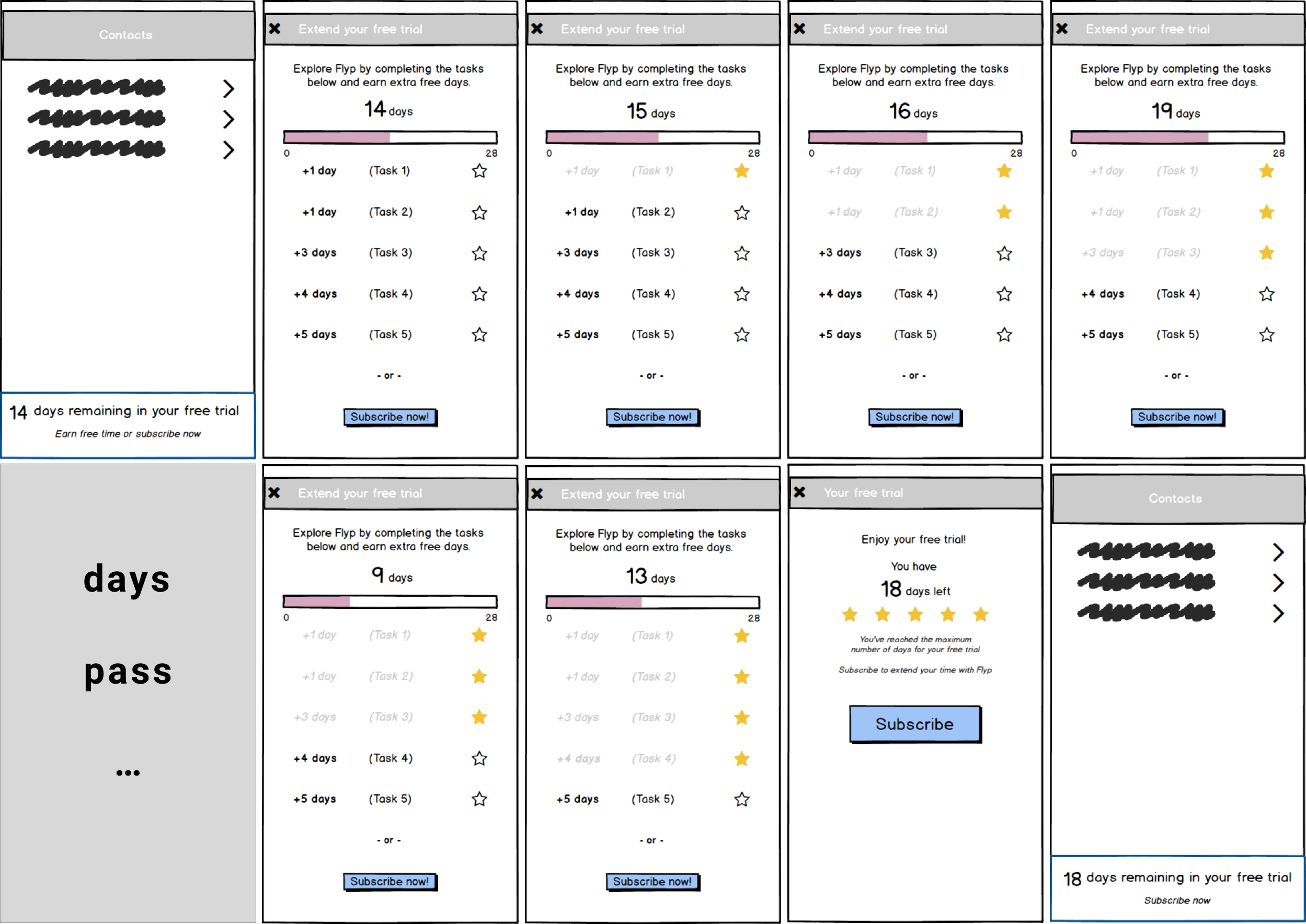
Gamified free trial wireframes
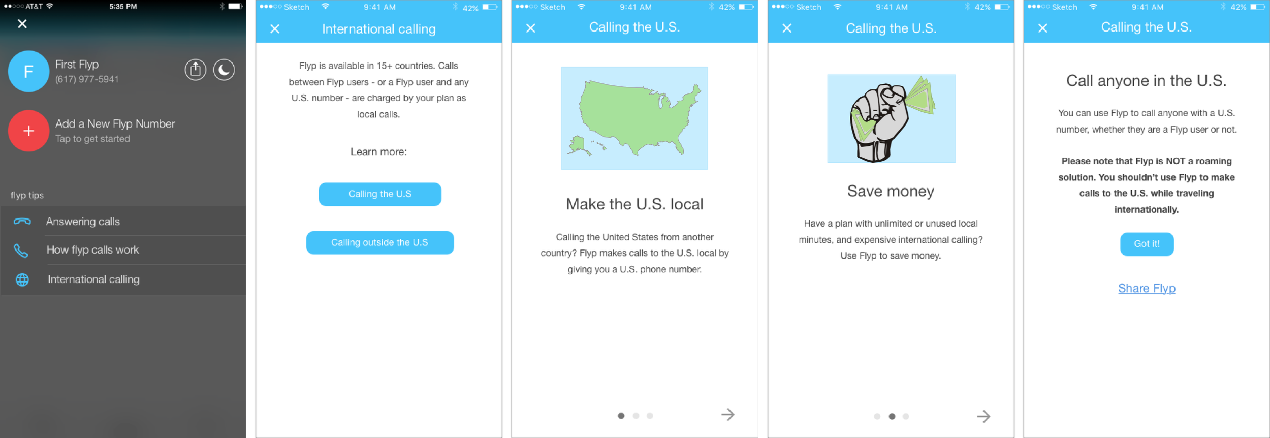
“Calling the U.S.” help content for iOS.
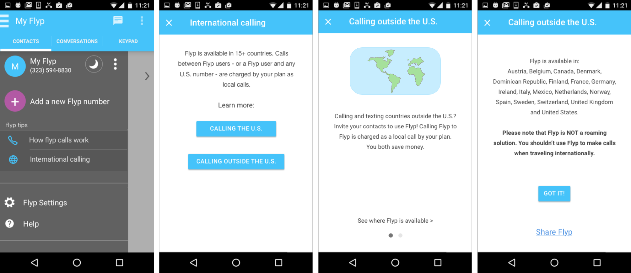
“Calling outside the U.S.” help content for Android
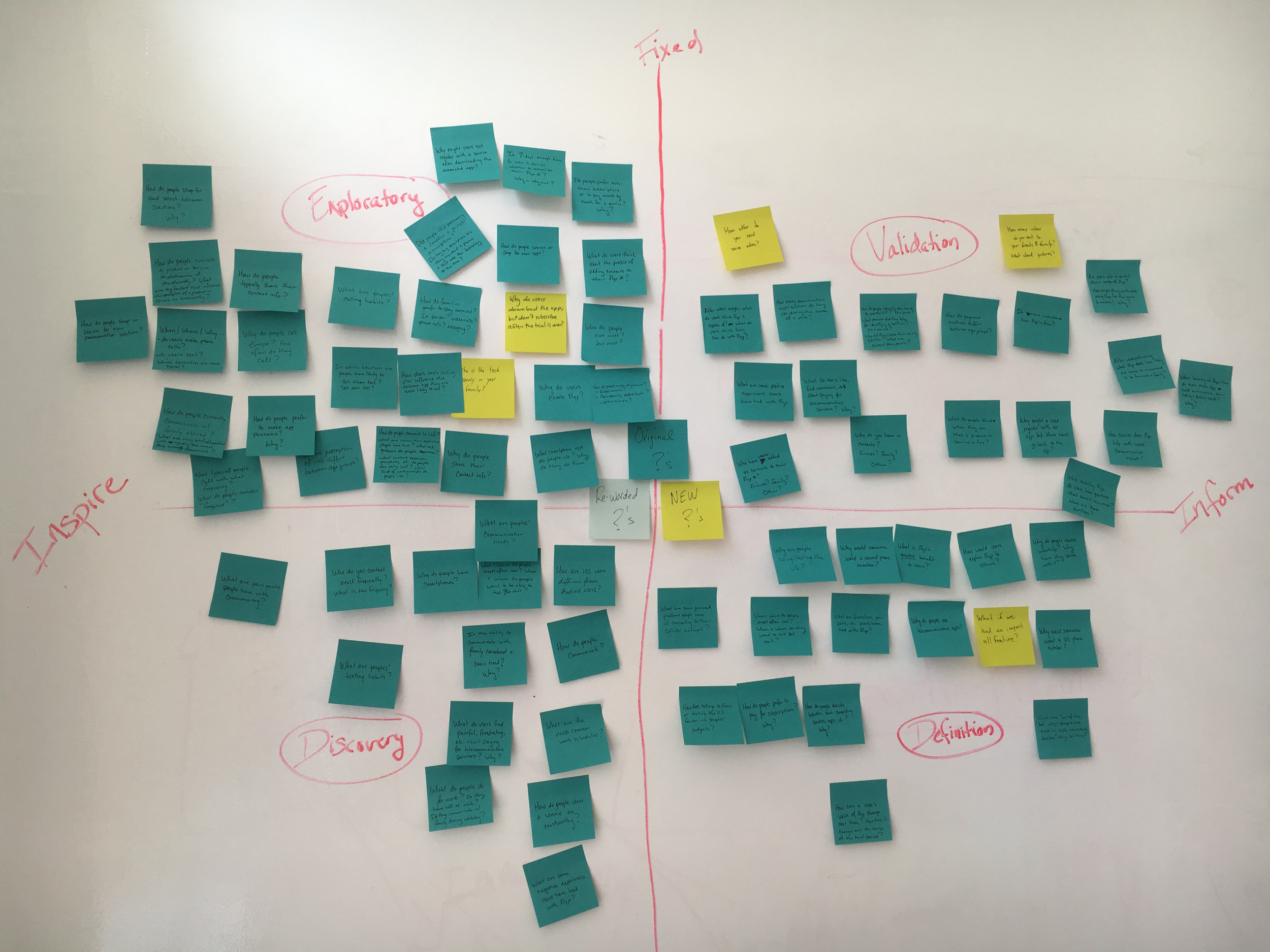
Research strategy framework with questions
Lessons Learned
After discovering a pain point or opportunity, explore multiple, alternate solutions in low-fidelity before committing to and increasing fidelity of the first idea.
Design UIs and write copy with with localization in mind, and use standardized, simple, and unambiguous copy for easier localization/translation.
Internal stakeholders with existing customer relationships are a valuable source of insight and information.
Want to learn more?